Has The Evolution Of Web Design Changed The Course Of Consumers?
As brands continue their push for online dominance, the scientific and marketing community has become keenly interested in the relationship between web design and consumer behavior, utilizing eye tracking research that shows that people scan webpages and phone screens in various patterns. In 2005, the revelation of the ‘Golden Triangle’ of eye movement found the majority of viewership to be on the left side of the page while another study by NNG Group revealed a distinct ‘F-shape’ of viewership. Over a decade after discovering these pattern, we revisit what it means today.
The F-Shaped Pattern
According to NNG Group, the F-shaped scanning pattern is characterized by a concentrated fixation at the top and the left side of the page. It implies that users first read/view a webpage horizontally, across the upper part of the content area. Thereafter, users move down the page and subsequently read across in a horizontal manner again; however, this time it is a bit shorter. Finally, users scan the content on the left side in a vertical movement, absorbing the majority of the left side of a web page. See an illustration below:
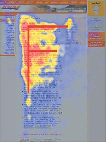
The implications of this pattern are:
- First lines of text and images on a page receive more gazes than subsequent lines of text on the same page.
- First few words on the left of each line of text receive more fixations than subsequent words on the same line.
- Heavy call to action on the top and left side of webpages.
Does Web Design Change The Eye Fixation On A Webpage?
Scanning on the web is dictated by:
- Users’ motivation
- Goals they are trying to achieve
- Layout of the page and formatting of text
- Page content
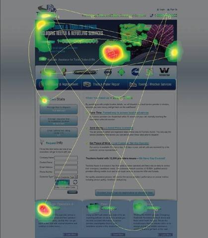
A 2017 study by Mediative found that across all three eye-tracking tests, it was clear that the F-model no longer applied. Utilizing a search results page on Google, the study found instead of the signature F shape, the results resembled much more like a backwards C, with users starting from top left and moving to the right and down, before going back to the left column where the organic listings were.
![]()
The Implications Of The Backwards C
Though this is a search result page and many of the eye patterns are dictated by things like video, sponsored ads, and organic rankings, this survey yields two important implications for web designers:
- The left side vs right side of a page doesn’t matter. Content in the right column was clearly influencing how far users were willing to look at organic listings.
- Guiding users toward your value proposition or call to action is necessary.
How Does This Change Web Design For Businesses?
1. Fitt’s Law Applies
When you are assembling a home page or landing page, be sure the elements that stand-out are the ones that matter, and that you aren’t giving too much weight to visuals that don’t encourage customers to take action. If your a B2C company, be sure your call to action (often times a phone number or fillable form) is clearly the most important and “weighted” part of your page. For B2B company’s, consider your value proposition in your market and insure that portion holds the most ‘weight’. For instance, large law firm websites that go after commercial clients (B2B), it is often the resume of the firm, dollar amounts settled, or notable cases that they have closed. On the other hand, local personal injury attorneys or local servicing law firms (B2C) may make it a point to have their phone number as the most weighted point of a page.
2. Faces Are Powerful When Used Correctly
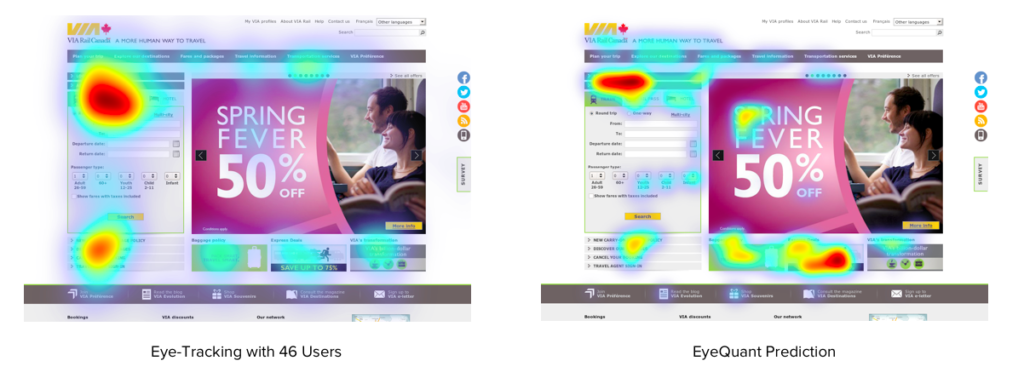
As humans, we’re naturally wired to always seek out and look at at any available faces first. The truth is that as humans we do really like faces. We’ll look at them sometimes. We probably even have a dedicated brain area involved in processing faces. However, we look at them much less often than you would typically believe. Take this study from the EyeQuant Company:
![]()
According to a study named Eye Gaze Cannot be Ignored, directional cues are the most important when utilizing human faces on the website. Human beings have a natural tendency to follow the gaze of others, and we have been coached since birth to follow arrows directing us to where we should be looking/going. Take these eye tracking heat maps in consideration and notice how the slight change in the baby’s directional cues drastically influence the website visitor:
![]()
![]()
3. Big Typography Is Loud
Big bold letters and words serve an enormous purpose when designing a website for aesthetics. However, for the B2C community especially, big typography is visually loud, but not at all a safe way to grab user attention. According to EyeQuant, the use of big bold letters may even be hindering the message:
4. Its All About The Scroll
A common misconception we often times comes across at Laddr Agency is the idea that the most important items need to be packed at the top of the first page in order to capture all the attention. The truth is, as humans we have come to love the scroll down the page. From your thumbs on an iphone to interactive touchpads, the ability to scroll is easier than ever.
Relying on the screen above “the fold” to do all of the heavy lifting is one of the biggest usability mistakes you can make. The idea that it is the only place web users will browse is a complete myth.
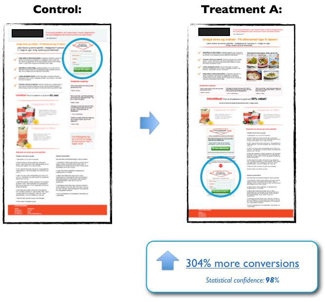
Multiple tests have shown that users have no problem scrolling down below the fold. Surprisingly, they will browse even further down if the length of the page is longer. A test by the folks at ContentVerve found the conversation rate of a scrolling Call to Action to be incredibly beneficial:
Where Does Modern Web Design Go From Here?
Rules of thumb are fun. They’re simple. And the more complex the thing is they’re trying to explain the more appealing they become. Alas, that’s also where they often fail – and visual attention is a rather complex, extremely context-driven system that cannot be captured in a set of simple rules. The distinction between a B2B and B2C company are important when designing your website. However, one thing that is a continual need is a modern, visually appealing website. As consumers and business stakeholders continue their push toward digital transparency, the need is higher than ever to create your business on the web, first and foremost.